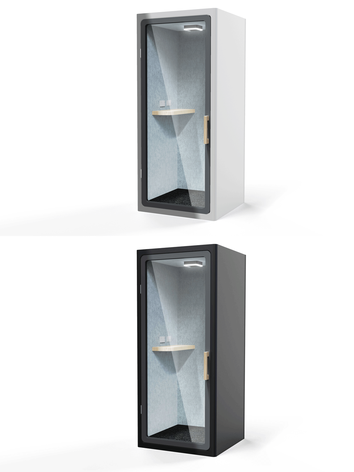
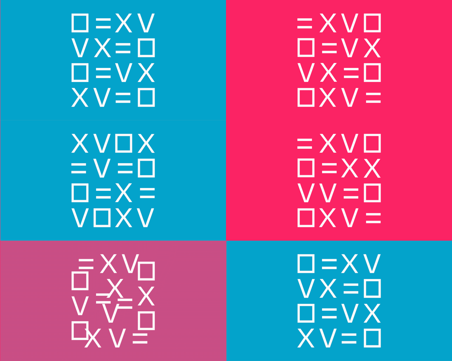
The brief was simple – create a sleek looking brand to cut through the noise and have swagger about it. The concept was developed to incorporate bold colours and loud personalities. We all know who these people are, and lets face it a solution like Vox booths is perfect. A visual language system was developed from the word VOX – V = Volume O = Booth/Box X = no sound so the visual identity becomes a double entendre for the word but also specifically outlining its use.
Maximum volume with minimum noise.
Project Scope
- Brand Identity
- Strategic Narrative
- Tone of Voice
- Website
- Stationery
- Marketing


