A dynamic real estate agency founded on industry legacy and strengthened with forward-thinking creativity, market intelligence and a levelheaded approach.
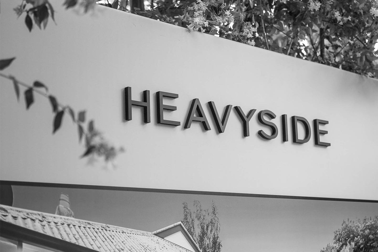
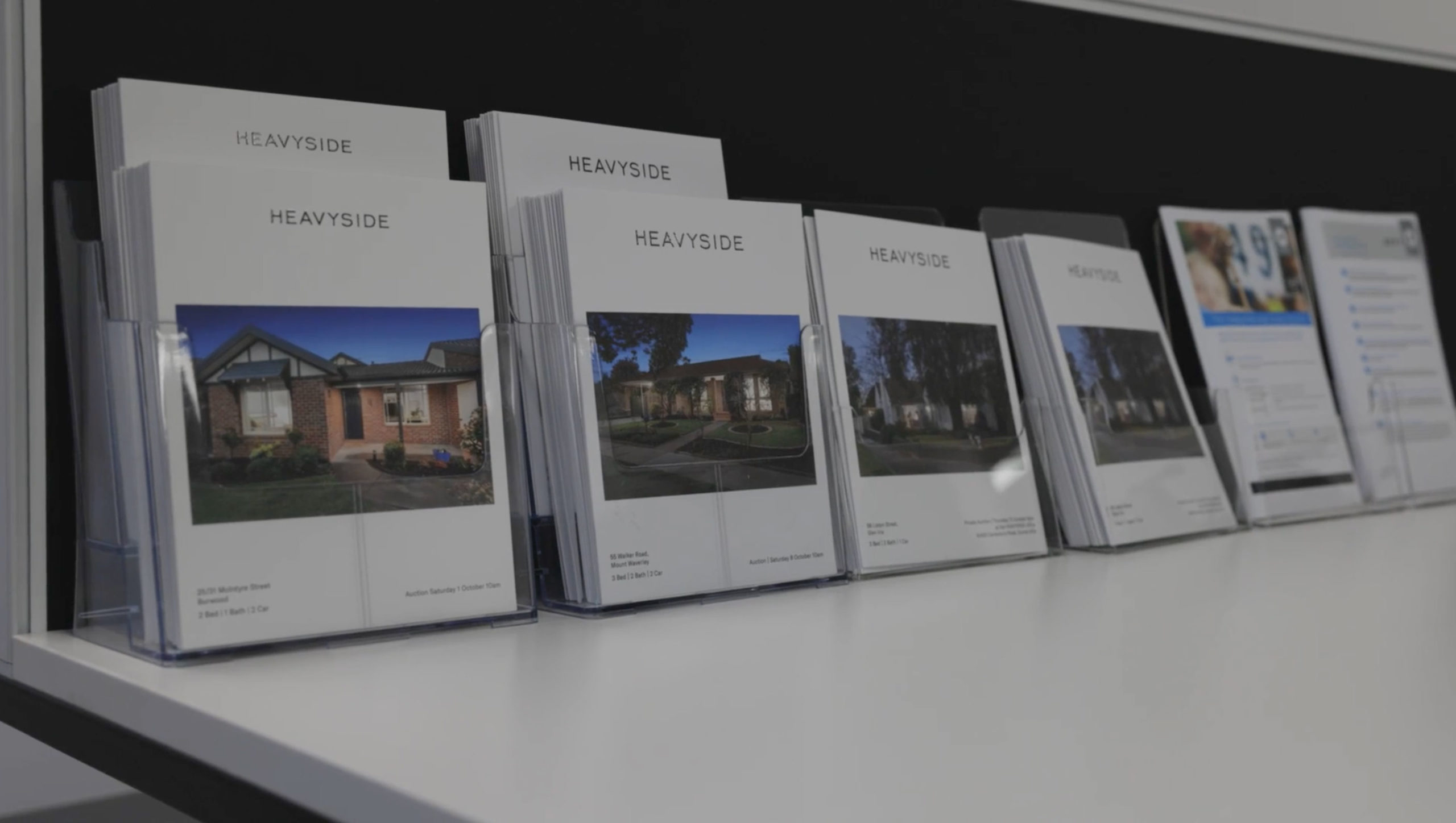
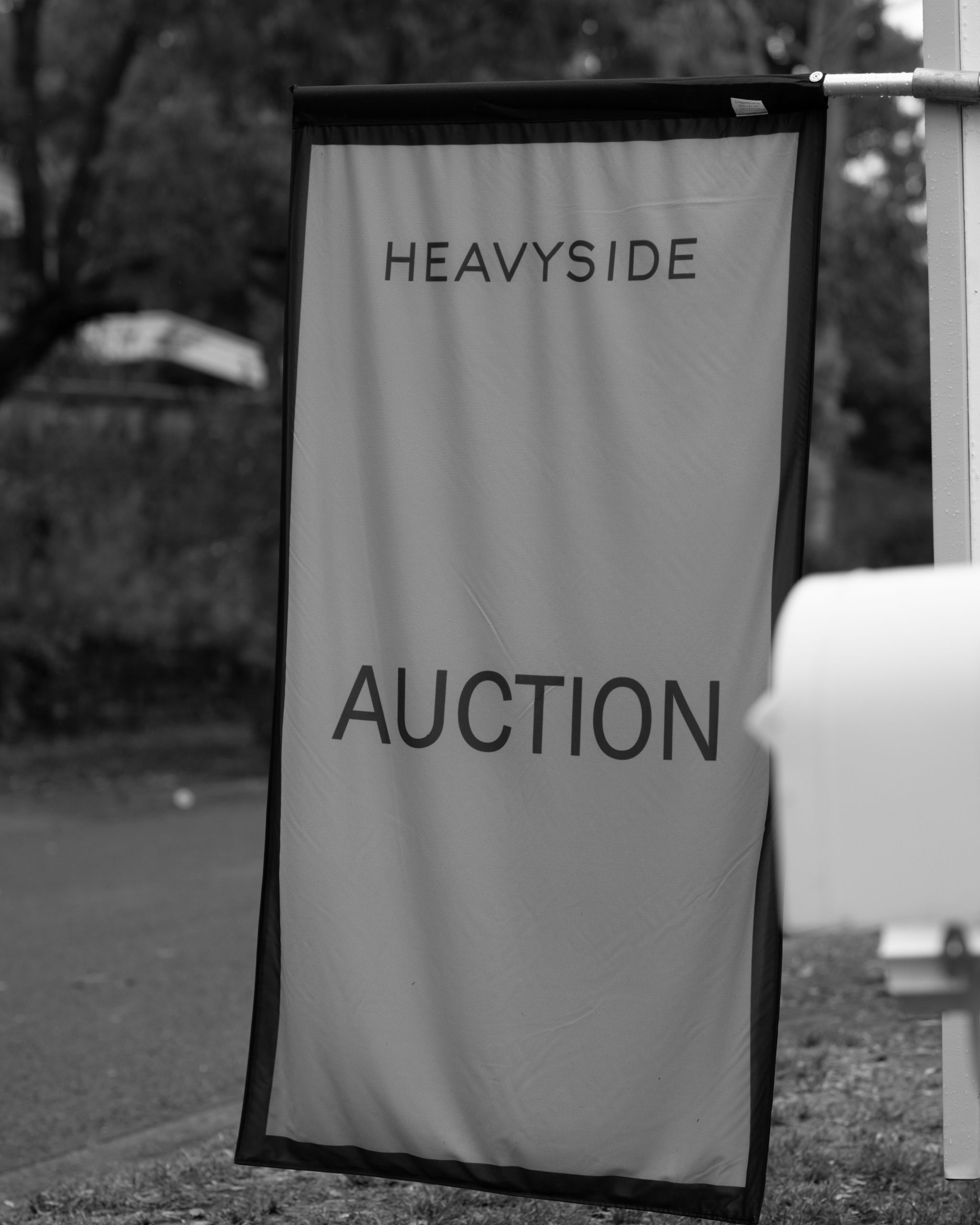
Bringing together legacy and modern creativity. An authentic brandmark, all set in caps conveys the legacy of the Heavyside name. A contemporary, wide typeface with fine line weight is used for the brandmark, to convey establishment. By generously spacing the characters out, it softens the brand and gives a sense of humility, giving each character its own breathing space. Taking the H from the brandmark, an abstract monogram is crafted that will distinguish the Heavyside brand from any other in the market.
