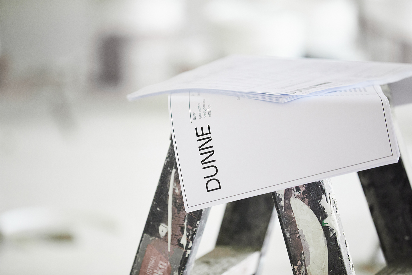
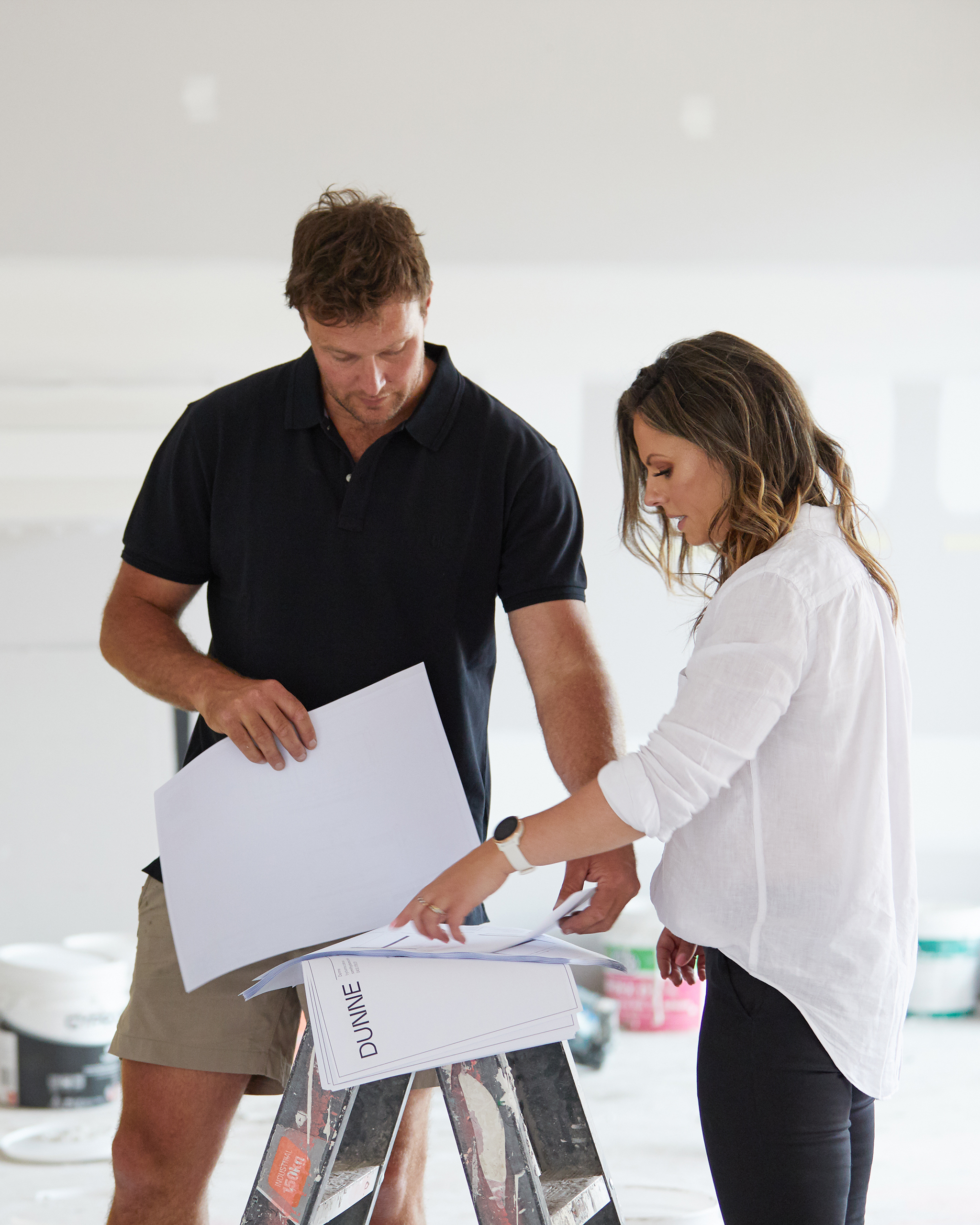
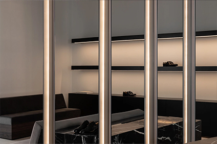
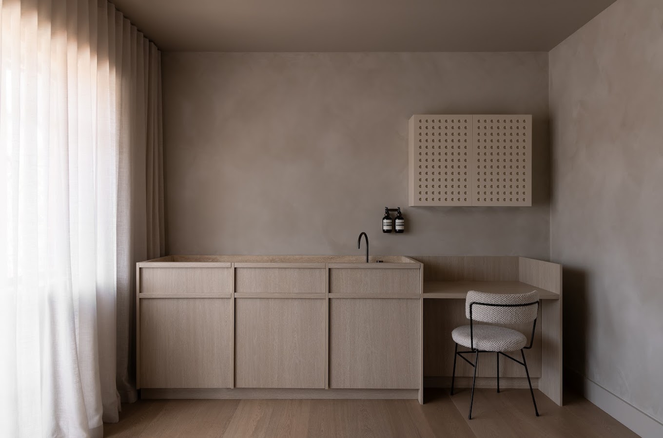
Dunne is a boutique design and build firm that blends refined aesthetics with practical functionality. Dunne build homes that enrich lives – defined by elegance and driven by simplicity.
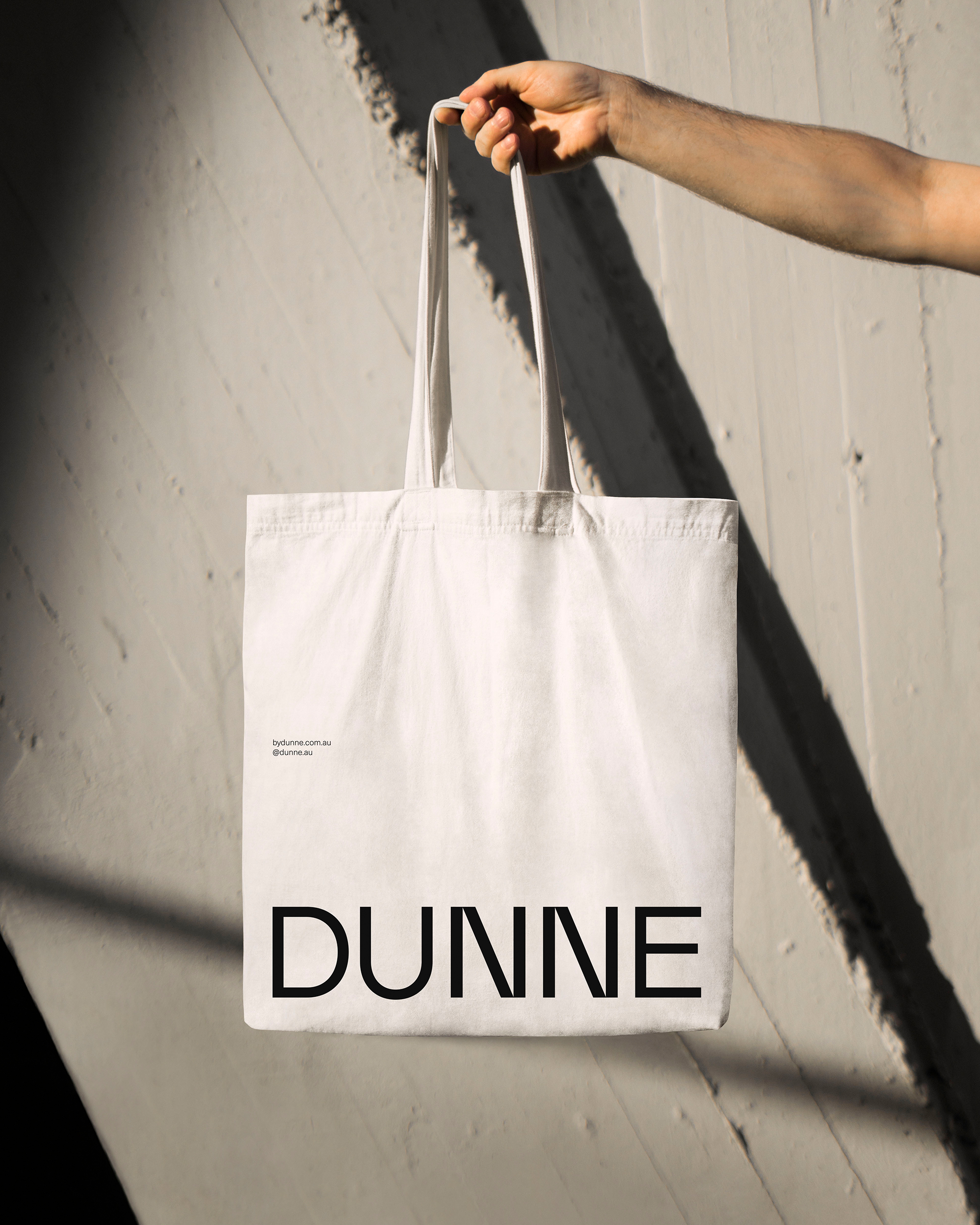
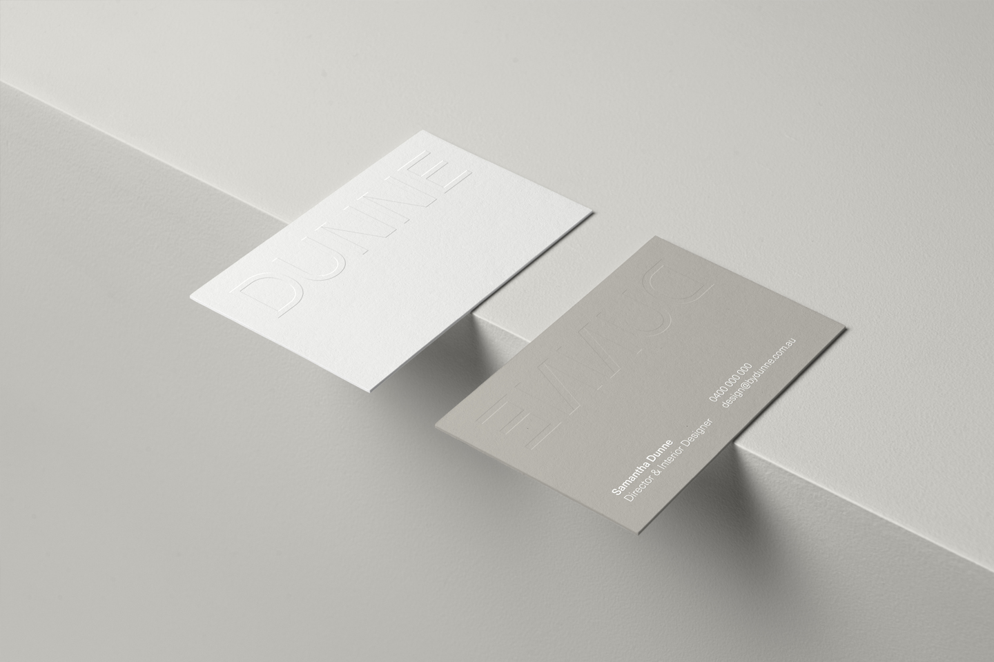
Creating a brand that redefines both the interior and the construction side of the business. A geometric typeface is selected for the brandmark to represents the construction side of the business. To balance it all out, a thinner and more refined weight of the font is selected to soften the brand. Setting the brandmark in uppercase gives the brandmark a sense of confidence, but not overpowering. The cuts in the N characters create a unique look to the brand. Characters are kerned tightly, portraying the warmth of the brand itself.
