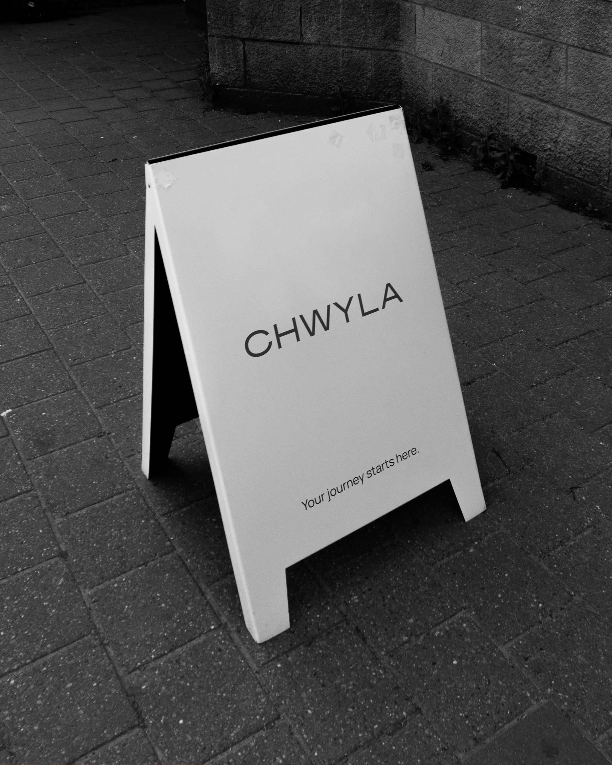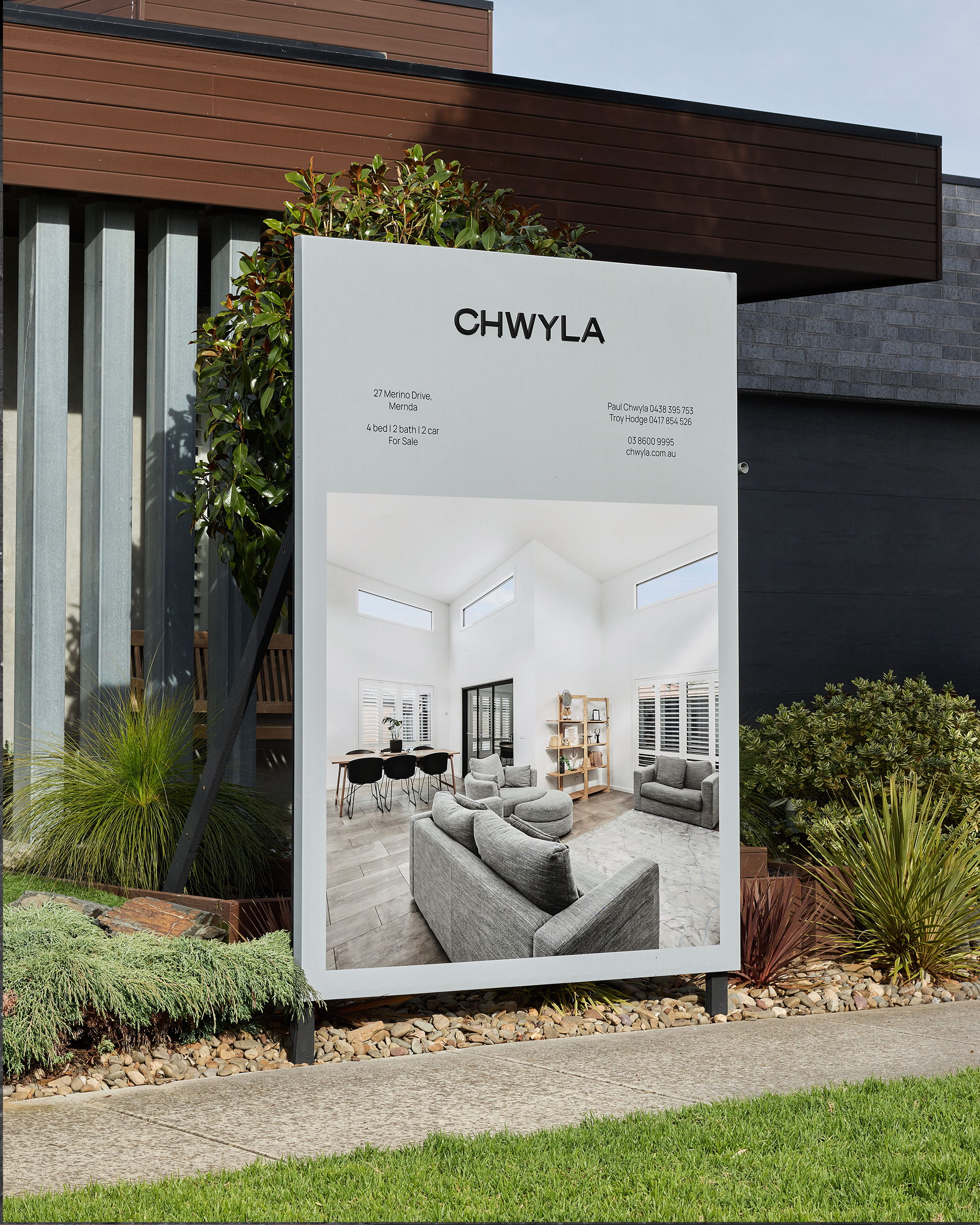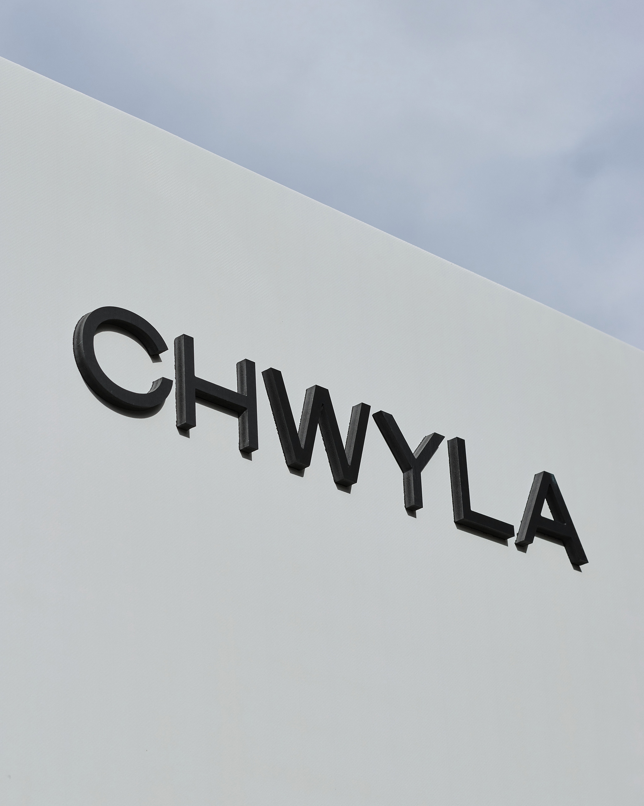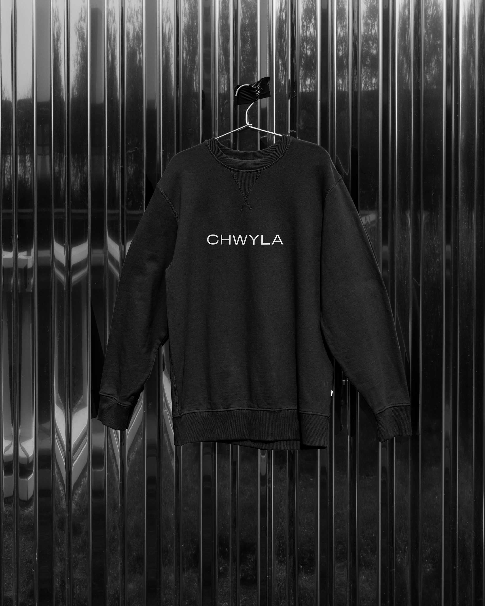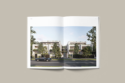
Bringing simplicity back to real estate. At CHWYLA, they’re just people, helping people. Whatever your journey is, they’re there for it. Fearless, influential, free from constraints and community minded.
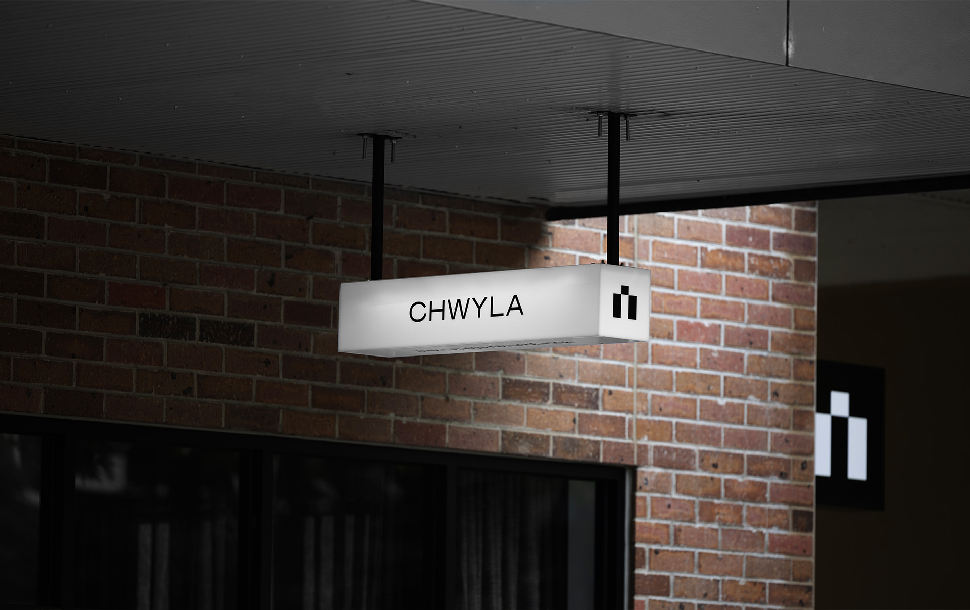
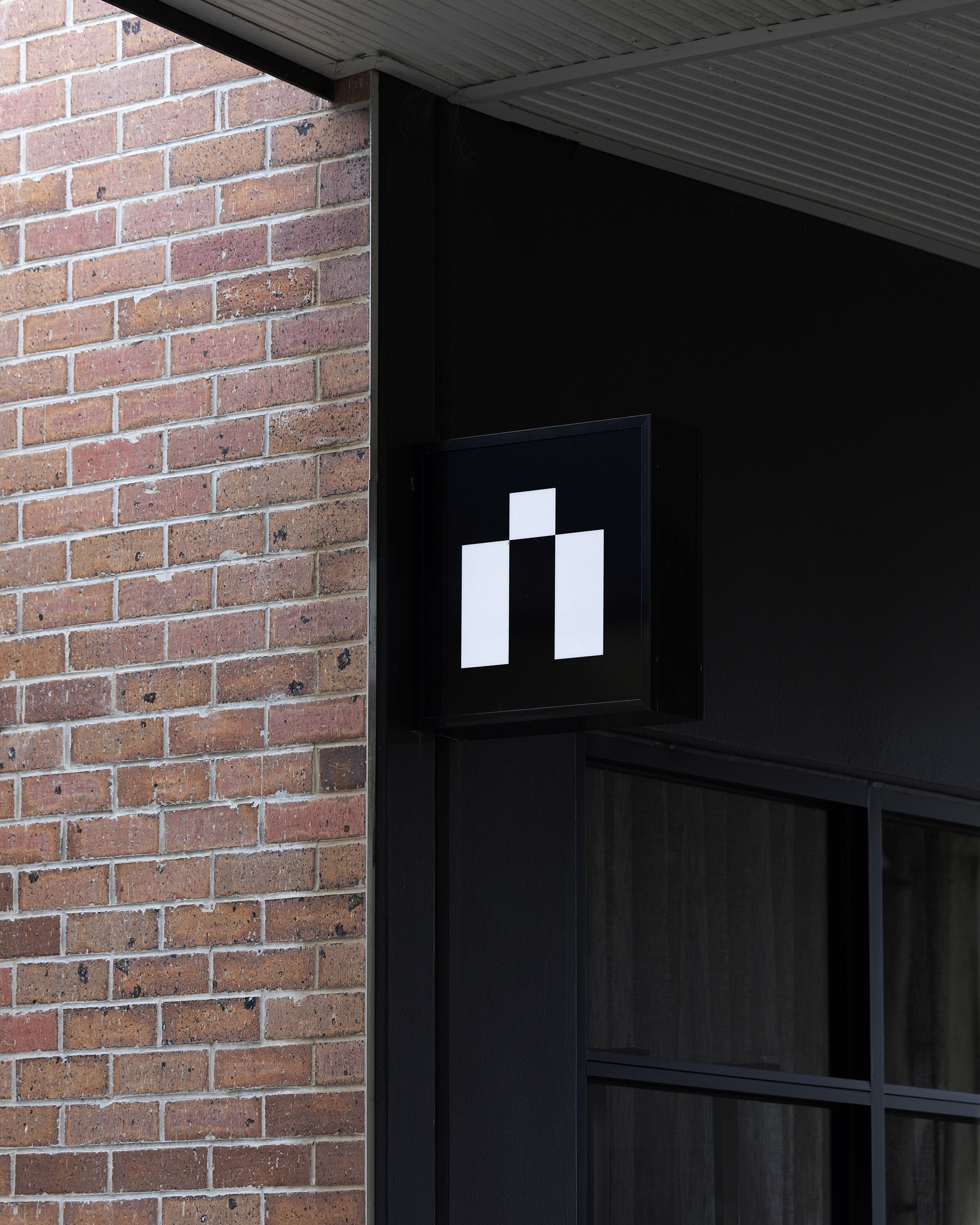
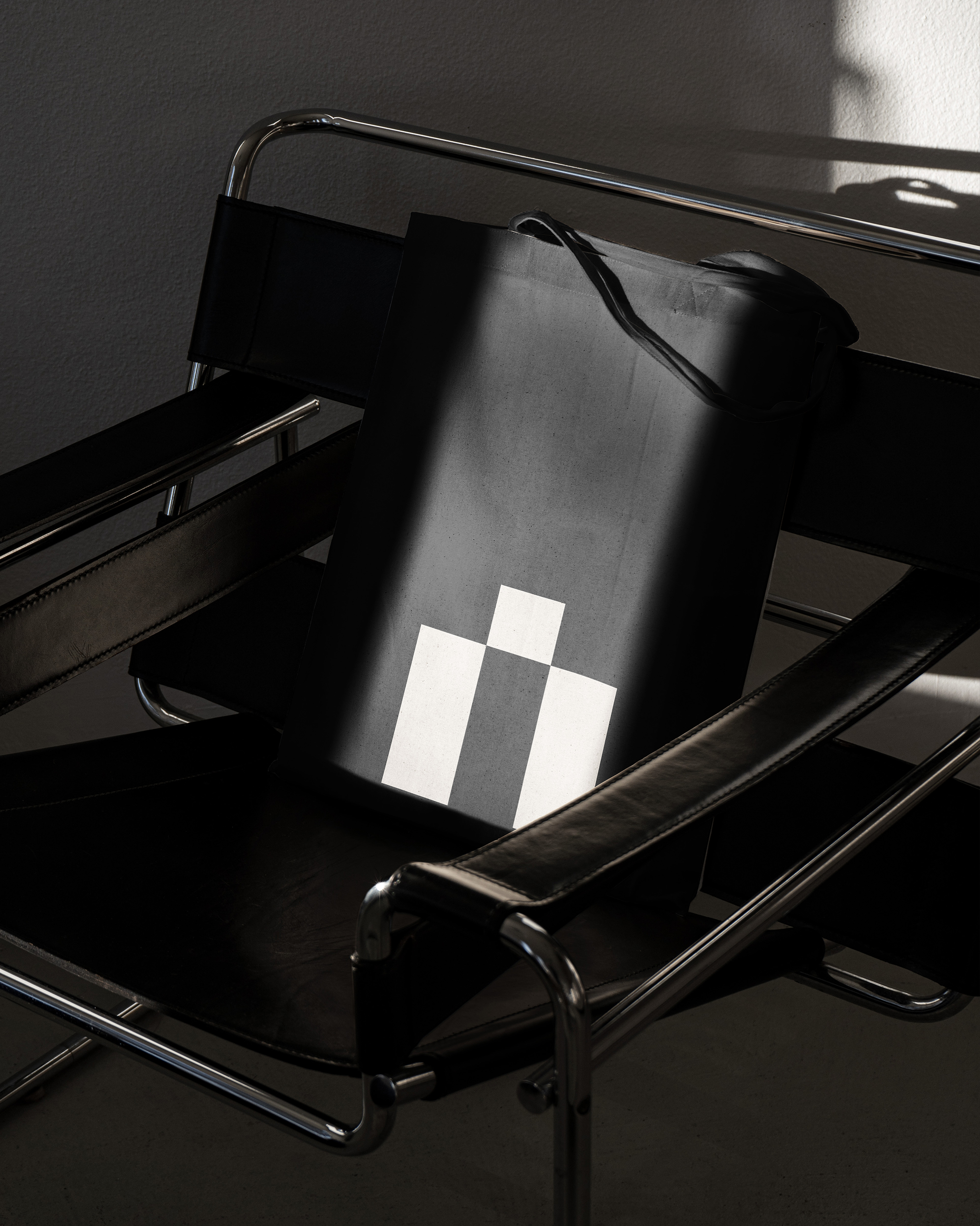
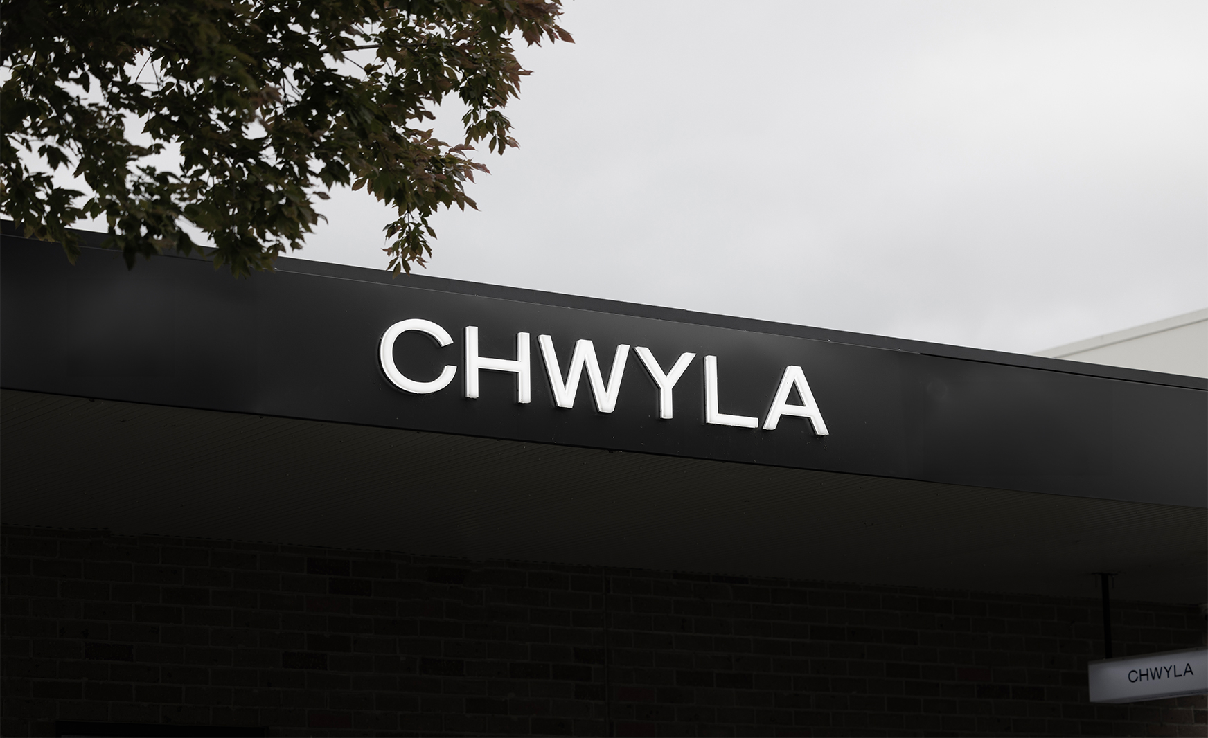
The brandmark is wideset and refined, to represent a brand that is grounded, strong and approachable. Thin lines mellow the brand make, creating a sense of comfortability. We crafted a unique monogram by rotating the letter C, reflecting the different pillars of the brand. With the monogram facing upwards, it portrays the strong ambition for the brand to always move upwards. We like to call it their brand lovemark, Paul calls it the castle.